

responsibilities
creative concepting, interaction design, ux design, user testing, ui design
methods
storyboarding, wireframing, user flow, interactive prototyping
tools
Adobe XD, Figma, Figjam, Optimal Workshop, Zeplin
the ask and the brainstorm
It was a fine May day. The sun was shining, the birds were singing, when I got the news. The Life Time Digital app, a point of high engagement with our members, didn’t have any sort of experience to welcome and orient new users. Seems reasonable to add. The timeline to get a fully baked concept in time for a high-stakes digital meeting? Six days. Cue the adrenaline—and collaboration.
The art director, copywriter and I all met for a mad brainstorming session that afternoon. As UX designer on the project, I was there to provide insight into how we could optimize the experience within our constraints. After running through requirements, our timeline and thoughts about how we could optimize the experience, we left with a plan and concept on which to execute:

first phase and first concept
The direction passed down for the welcome experience had been clear—it was to be video-based and cover a broad number of features.
To increase efficiency we decided to templatize our approach, treating each feature as a separate “chapter” in a narrative.
In digging through the problem space, we questioned if this approach alone would truly orient users. We decided to propose a phased approach, with Phase 2 being a fully interactive experience integrated within the app.

Lovely storyboards with art direction by Robert Pflaum, copy by Andrea Raab, and an assist on layout and imagery from me.
day four: the fateful review
With a lot of elbow grease and effective communication, we managed to whip our concept and storyboards into shape for review with our partners. While they appreciated the work and thinking, there was additional direction they wanted to incorporate: make it more functional and start every “chapter” from the home screen.
This was a pivot, for sure, but we had a great team. We would get it done, and do it well.

We both prototyped an interactive experience and built an interactive presentation to house it.
The next couple days were a blur of clicks and keyboard shortcuts in Adobe XD. Not only were we executing a revised concept, we were creating two versions for our Club and Digital audiences—and making it an interactive presentation with prototyped simulations of the videos. I delight in the sometimes puzzle-like nature of getting prototyped interactions to the best possible state, and this was definitely a test of how I could execute those skills.

That’s… 134 screens to make the interactivity work.
To see how the interactivity played out, take a look at the video below:
day seven and beyond: concept into reality
After waiting with bated breath, we were thrilled to hear that the presentation of the concept was a success. They loved it. Now it was time to make it happen.
This was the phase where I stepped in as primary UI designer. The concept was beautiful, but when considering the reality of execution we realized we could more closely align to our current app design standards. I utilized existing patterns where I could, and created new ones where needed that would feel natural and could be integrated into the design sytem.

Sketch to prototyped UI. Three concepts for a pagination interaction that is clear, accessible, and leaves room for a description.
In the process of updating the experience, I made numerous UX/UI improvements. These included a clearer pagination and navigation system, updated CTAs to make the action clearer to the user, and a indicator for new videos. To view the screens in more detail, click the button below:
“but wait! where will it live?”
From the beginning we knew that this tour would be shown to new users the first time they opened the app. In the process of updating the UI to match the app, we realized that we were hazy on the rest of the journey. What about users who might skip and want to view it later? Or those who want an explanation of a newly added feature?
We knew we wanted the app tour should have a permanent home in the app, but we weren’t sure where. “Hey!” I thought. “Why not go to the users themselves?”
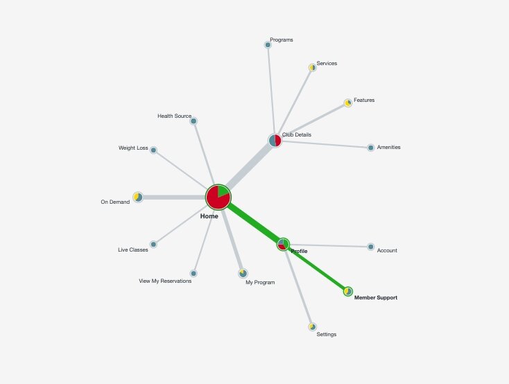
tree testing and results
I’d used Optimal Workshop in the past, and thought a tree test could be a great way to get an idea of where users would expect to find such a tutorial video. I set up a Treejack test and used UserTesting.com to recruit and record participants of a similar demographic to our member base.
The results were slightly surprising, but that’s the joy of user research! There was no clear winner, though The Profile section won out by a narrow margin. Confusion around other categories could have been heightened by unfamiliarity with the brand.
It did highlight in my mind the need to be highly transparent with the messaging. In addition to mentioning its location within the tour itself, we decided to feature it on the homescreen for the first thirty days after the user first downloads the app.
let’s make a user flow
With the issue of where the tour was going to permanently live settled, we next turned to the question of what possible user paths existed for this experience. We had brand new downloads, people who had downloaded a while ago, people who downloaded a few days ago. To help clarify the different paths, I created a user flow in Figjam. It showed the possible experiences and would serve as an artifact to help the team understand what users would see, when.
3… 2… 1… handoff
With UX and UI updates approved, it was time to put this feature into production. This was a two-fold process: one piece was collaborating with our video producer to create videos for each segment in the right specs for mobile.
One problem we encountered when producing videos was accounting for dark mode—we were already producing eight versions of each video to account for all our app variations. We didn’t want to double that. I ended up creating a pretty easy solution—pick a neutral grey background that worked with either mode.
The other piece of the process was collaborating with the mobile dev team. As I’d mostly focused on web, this was my first native app development project. I quickly learned how to navigate around Zeplin, optimize Figma files and communicate requirements with the dev team. (Checking the export button in Figma so devs can grab assets from Zeplin? Important step.)
current state and next steps
As of the time I’m writing this, the app tour feature is currently in development and set to launch soon. After it goes live, I’m hoping we can get some juicy analytics and customer feedback to iterate on the experience, using those insights to fuel phase 2 as well.