

responsibilities
product strategy, information architecture, user research and testing, ux design, ui design
methods
competitive research, ecosystem mapping, affinity diagramming, user flows, prototyping, usability testing, style guide, qa
tools
Miro, Sketch, InVision, Adobe XD, Keynote, UserTesting
in the beginning: seasonal editorial content
Fun fact: Life Time has its own healthy lifestyle magazine called Experience Life. It’s pretty great, has won awards, and is chock-full of interesting recipes, articles and more.
Another fun fact: Life Time also has many other experts who produce editorial content, across multiple branches of the Life Time family.
Our business partner, the editor-in-chief at Experience Life, came to us with a request: create a blog section on the Experience Life site where we could host seasonal editorial content.
blog sphere competitive research
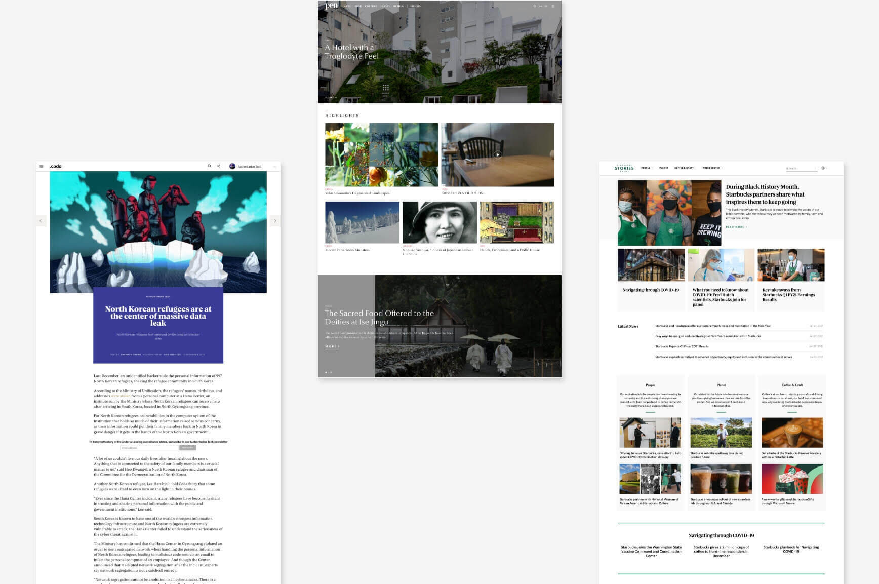
To produce a site that felt brand-right and contemporary, I scoured blogs within and outside the health space, cataloguing common user needs and interaction patterns addressing them.
Some of my key findings were the importance of personalization through collection and recommendations, content curation with on-trend collections and the integration of company stories with meaningful messaging.
taking a holistic step back
Our team then dove into whiteboarding sessions, breaking down the competitive space and content requirements. We came to a realization: we had a lot of questions and a big opportunity. How would other content fit into this vision? Could we make the experience less promotional and more informative and transformative?
What if we could create a content hub that would feed users content from across our brands, adding value to their memberships and positioning Life Time as a healthy living thought leader?
pitching the content hub
Now that we were armed with a refined high-level vision and competitive knowledge, it was time to hone in on the business opportunities to get buy-in from our partners and stakeholders. We crafted positioning statements, a high-level ecosystem, name concepts and a conceptual prototype to bring our vision to life.
Insight Statement—
“Life Time has a growing wealth of expert content from a wide breadth of sources to which we need to connect our users—and through that content, encourage them to more deeply explore the Life Time ecosystem.”
Idea Statement—
“Design a Life Time content hub that aligns to Life Time brand’s standards and current trends to provide seamless and elevated educational experience.”
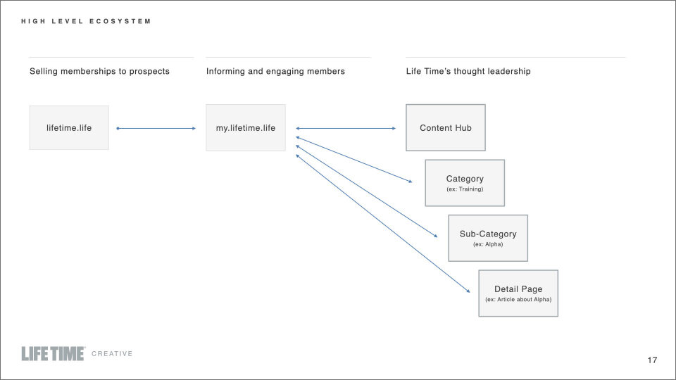
High-level ecosystem showing how Life Time’s thought leadership in the content hub can lead to reciprocity and deeper engagement with our other properties.
design: information architecture and wireframes
With enthusiastic buy-in attained, the next step was actually executing on the thing. It was time to refine our high-level architecture into actual navigation and fully flesh out the prototypes. Meanwhile, we also settled on a name: The Source.
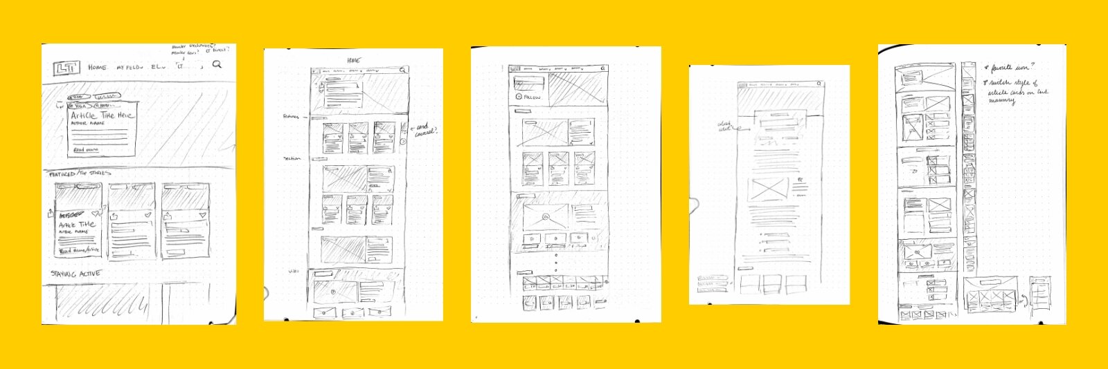
The sketching phase.

There were a lot of screens.
To view wireframes in more detail, click the button:
Some of the interaction states I prototyped using XD. Fun!
Because we were creating a new content site on a new platform (Wordpress) with new content types, there was a lot of opportunity for new patterns and components. It was a joy to create new design patterns such as article collections and category carousels that elevated the user experience but still felt consistent with our brand.
interlude: covid
Around this time in the process, COVID-19 struck hard. Everything changed: our clubs closed, we started working from home, we scrambled to find digital solutions. Even in the midst of unprecedented change, we realized that our digital content was needed by our users than ever. We could make a difference by helping people maintain their health at home.
delivering a high quality mvp
Despite COVID restricting our scope and resources, we all agreed it was a high priority to make The Source available to our members. We could make a difference by helping people maintain their health at home. We envisioned how The Source would immediately benefit the Life Time brand with an ecosystem map, and supported it with specific user journeys as we went through another round of presentations.

Content ecosystem showing both sources and amplifiers for our soft and hard launch.
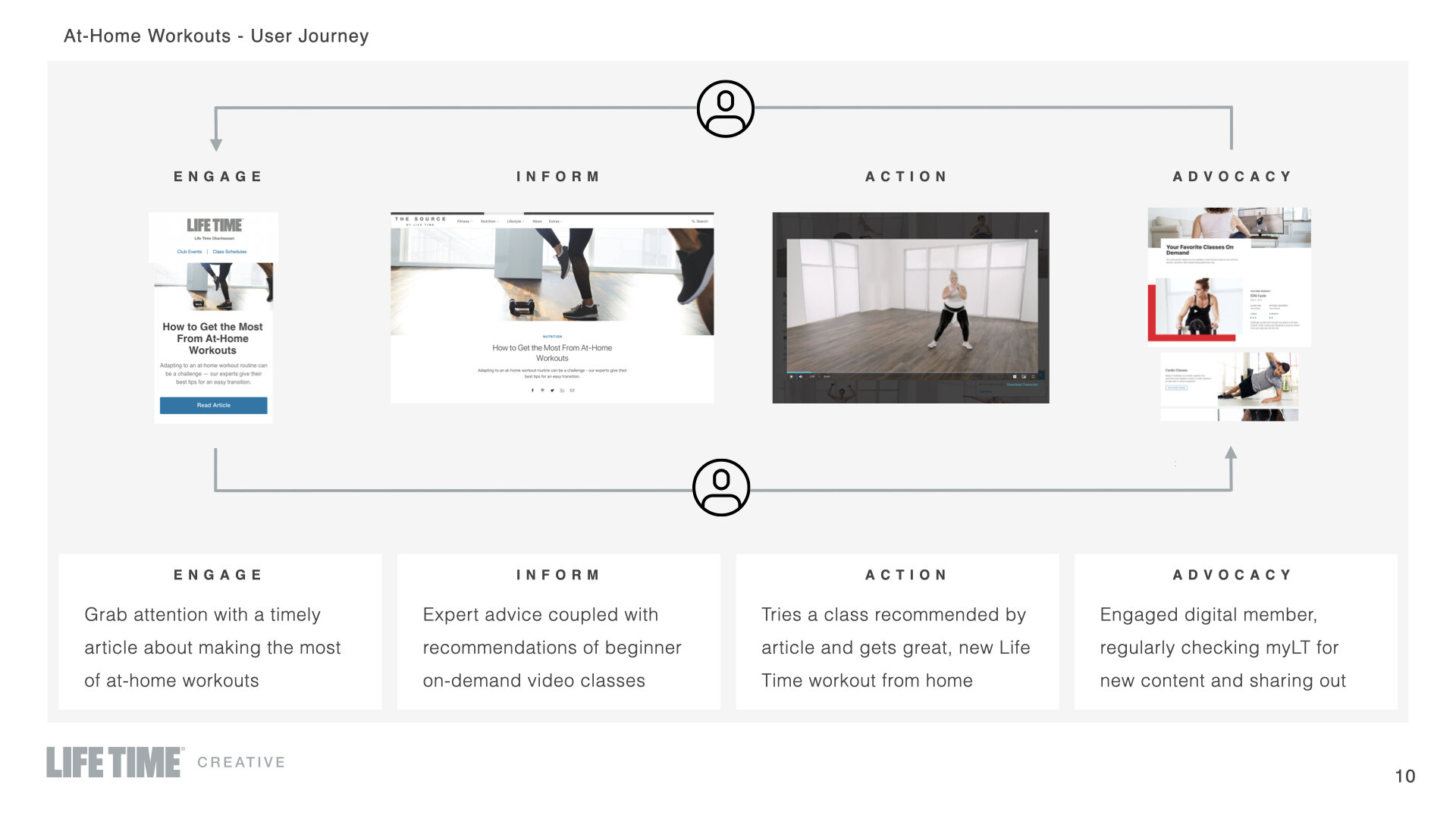
User journey to illustrate how content pieces can feed the Life Time ecosystem.
We agreed to launch with an MVP, paring it down to the most essential features for launch. We handed off our refined wireframes to our Wordpress developer in XD, working closely on QA to ensure a refined product consistent with our other web properties. I also created a style guide to ensure consistency.

phase 1 usability testing
After launching our MVP, I conducted usability and impression testing on basic features of the website now that it was filled with content. I used UserTesting to carry out the remote, unmoderated tests.
One particularly interesting and challenging goal of testing was to determine which of two type style variations was better for readability and scannability. I had users browse two articles for particular pieces of information, comparing their speed and browsing patterns. (The updated type won.)

Word cloud about how the homepage made users feel.

Impression testing results.
“Even though I’m familiar with Life Time as a gym, the website isn’t overly marketing the gym membership aspect and it’s more focused on having valuable information.”
In the initial impression and emotive testing, it was exciting to find that users found what we were offering to be valuable, and generally easy and intuitive to use.
Of course, we wanted to look for areas to improve, too, and we did find pain points we could act upon. Overall users desired a more structured experience, more active ways to interact with content, and clearer differentiators of our content offerings.
Though we didn’t have further development resources at the time, we ended up created further categorization by content type on the homepage and adding a comment function.
current state and next steps
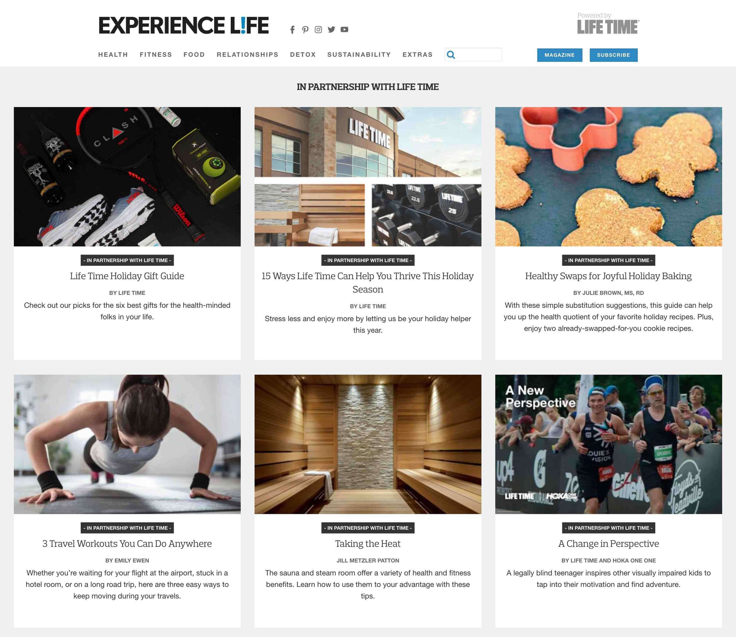
In the first quarter of 2021, the magazine site, Experience Life, and The Source merged to become one entirely centralized content site under the Experience Life name. We assisted with the merge, providing additional templates for new content types like podcasts and issue archives.
As we’re still in Phase 1 of the design, ideal next steps would be to begin development on some of the Phase 2 components to enhance the experience, like curated collections and a custom video player. I would also take the opportunity to conduct further usability testing and member surveys to determine current pain points we could improve upon in the next iteration.